Plotting WordPress downloads with Pandas and Matplotlib
Recently I wanted to figure out a bit more about how popular WordPress plugins are used. Helpfully, WordPress plugin repository does provide a JSON API endpoint for fetching download statistics of any plugin in the plugin repository, e.g.:
https://api.wordpress.org/stats/plugin/1.0/downloads.php?slug=akismet&limit=365
It is used for plotting the stats on plugin pages, and it works for my purpose as well.
There are two things I wanted to know from these stats: 1) How many downloads happen on average each day of the week; 2) How many total downloads happen in a week
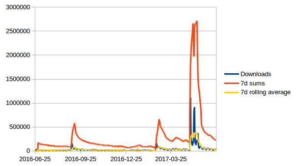
First I started by manually importing the data into LibreOffice Calc and calculating the moving weekly sums and moving 7d averages myself (for each daily downloads cell sum over last 7 ones, and average over last 7 ones).

For a quick plot it worked, but was not very convenient to update if you would like to take a look at multiple plugins every so often. So this was my excuse to play around with Pandas and Matplotlib to build something a bit more convenient in Python.
Setup
To begin we’ll use several libraries:
- Requests to download the JSON stats;
- Pandas for data manipulation and to run our extra calculations;
- Matplotlib to plot the results.
As usual, we start by creating a virtual environment. For this I used Python 3:
virtualenv -p python3 venv
source venv/bin/activate
And installed the dependencies in our virtual environment:
pip install requests matplotlib pandas
We start with the initial dependencies and download the stats from WP plugin repo:
import pandas as pd
import json, time, requests
import matplotlib.pyplot as plt
from matplotlib import style

url = 'https://api.wordpress.org/stats/plugin/1.0/downloads.php?slug=akismet&limit=365'
r = requests.get(url)
data = r.json()
data now contains a dict with dates for keys, and number of downloads for values. DataFrame expects a list-like object for data parameter, so we will need to reshape the data first from dict to a list of dicts.
While we’re at it, we’ll convert date strings into date objects:
data = [
    { 'timestamp': pd.to_datetime(timestamp, utc=False), 'downloads': int(downloads) }
    for (timestamp, downloads) in data.items()]
data = sorted(data, key=lambda item: item['timestamp'])
At this point we have converted the initial stats dictionary:
{'2017-03-21': '36723', '2016-08-17': '18061', '2016-06-26': '17821', '2016-09-14': '52539', ...}
Into a list of dictionaries:
[{'timestamp': Timestamp('2016-06-25 00:00:00'), 'downloads': 18493}, ...]
However, if we pass the resulting list into a Pandas DataFrame, we will see that it is indexed by row number, instead of by date:
>>> pd.DataFrame(data)
     downloads  timestamp
0        18493 2016-06-25
1        17821 2016-06-26
2        29163 2016-06-27
3        28918 2016-06-28
4        27276 2016-06-29
...
To fix that, we reindex the resulting DataFrame on timestamp column:
df = pd.DataFrame(data)
df = df.set_index('timestamp')
And get:
>>> df
            downloads
timestamp
2016-06-25      18493
2016-06-26      17821
2016-06-27      29163
2016-06-28      28918
...
Now that we have our raw data, let’s calculate the 7 day average. DataFrame.rolling() works nicely for this:
weekly_average = df.rolling(window=7).mean()
The way it works is it takes a number of sequential data points (in our case - 7 days) and performs an aggregate function over it (in our case it’s mean()) to create a new DataFrame:
>>> weekly_average
               downloads
timestamp
2016-06-25           NaN
2016-06-26           NaN
2016-06-27           NaN
2016-06-28           NaN
2016-06-29           NaN
2016-06-30           NaN
2016-07-01  24177.857143
2016-07-02  23649.857143
2016-07-03  23186.857143
2016-07-04  22186.428571
...
We can use the same approach to calculate weekly sums:
>>> weekly_sum = df.rolling(window=7).sum()
            downloads
timestamp
2016-06-25        NaN
2016-06-26        NaN
2016-06-27        NaN
2016-06-28        NaN
2016-06-29        NaN
2016-06-30        NaN
2016-07-01   169245.0
2016-07-02   165549.0
2016-07-03   162308.0
...
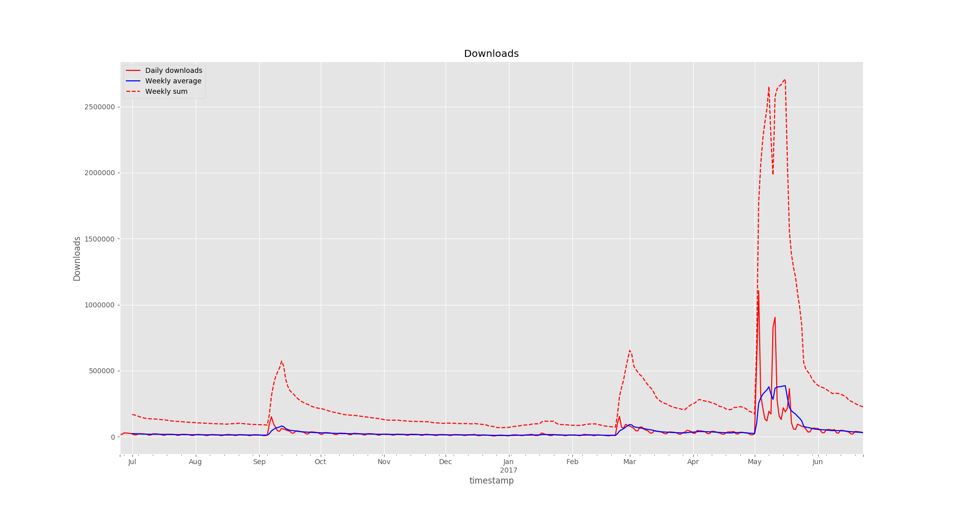
Now onto plotting. We want to display all 3 series (raw downloads, weekly averages and weekly sums) on a single plot, to do that we create a subplot:
# Setting the style is optional
style.use('ggplot')
fig, ax = plt.subplots()
fig is the figure, and ax is the axis.
We could call the df.plot() command and it would work, but before we do that let’s set up more presentable column names for the legend:
df.columns = ['Daily downloads']
weekly_average.columns = ['Weekly average']
weekly_sum.columns = ['Weekly sum']

ax.set_xlabel('Time')
ax.set_ylabel('Downloads')
ax.legend(loc='best')
And lastly we plot the data:
df.plot(ax=ax, label="Daily downloads", legend=True, style='r-', title="Downloads")
weekly_average.plot(ax=ax, label="7 day average", legend=True, style='b-')
weekly_sum.plot(ax=ax, label="7 day sum", legend=True, style='r--')
plt.show()
For line styles, r- refers to a solid red line, r-- is a dashed red line, and b- is a solid blue line.
You can refer to lines_styles.py example and lines styles reference for more details on styling.
Results

Visually perhaps it looks somewhat similar to the LibreOffice Calc variant, but with some extra effort we could generate graphs for a much larger number of plugins, add extra data or metrics, generate image files. And now we can use Matplotlib tools to zoom in and out of different sections while looking at specific details in the plot.
The final code looked like this:
import pandas as pd
import json, time, requests
import matplotlib.pyplot as plt
from matplotlib import style

url = 'https://api.wordpress.org/stats/plugin/1.0/downloads.php?slug=akismet&limit=365'
r = requests.get(url)
data = r.json()
data = [
    { 'timestamp': pd.to_datetime(timestamp, utc=False), 'downloads': int(downloads) }
    for (timestamp, downloads) in data.items()]
data = sorted(data, key=lambda item: item['timestamp'])

df = pd.DataFrame(data)
df = df.set_index('timestamp')

weekly_average = df.rolling(window=7).mean()
weekly_sum = df.rolling(window=7).sum()

style.use('ggplot')
fig, ax = plt.subplots()

df.columns = ['Daily downloads']
weekly_average.columns = ['Weekly average']
weekly_sum.columns = ['Weekly sum']

ax.set_xlabel('Time')
ax.set_ylabel('Downloads')
ax.legend(loc='best')

df.plot(ax=ax, label="Daily downloads", legend=True, style='r-', title="Downloads")
weekly_average.plot(ax=ax, label="7 day average", legend=True, style='b-')
weekly_sum.plot(ax=ax, label="7 day sum", legend=True, style='r--')
plt.show()
Subscribe via RSS